


Adding Marks
Add a mark at any position.

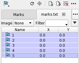
The Mark Panel can handle multiple datalists in tabs. However, the tab is not displayed in the initial state because there is only a default tab (Marks Tab). It is displayed when the tab becomes two or more by loading a new file or by adding a tab from the menu.
You can also select tabs in the menu from the  button displayed on the right side of the tab display.
| Icon | Item | Action |
|---|---|---|
 |
Top | Scroll to the top of list. |
 |
Previous | Scroll to the previous line. |
 |
Next | Scroll to the next line. |
 |
Bottom | Scroll to the bottom of list. |
 |
Previous Bookmark | Scroll to previous Bookmark (shown only with bookmark). |
 |
Next Bookmark | Scroll to next Bookmark (shown only with bookmark). |
| Menu | Action |
|---|---|
| Next | Center the screen to the next Mark in datalist. |
| Prev | Center the screen to the previous Mark in datalist. |
| Auto Jump | Toggle whether to center the selected mark on screen when the selection is changed in the Mark list by cursor keys. |
| Shape | Specify the shape of the mark to be created. |
| Refresh Image | Refresh the image of Mark in the current displayed tab. |
| Load Mark Location File | Open the Load Mark Location File dialog where you can load CSV file. |
| Save Mark Location File | Open the Save Mark List File dialog where you can save the marks in the current tab. |
| Clear All | Clear the current tab. |
| New Mark Tab | Add a new tab for Mark. |
| Close Tab | Close the current tab. Clear the current tab if it is the default tab. |
| Close all Tabs | Close all tabs. The default tab is only cleared. |
| Edit Columns | Edit the data columns. This item is displayed only when specifying Advanced Configuration of Mark. Refer to Advanced Configuration of Mark page. |
| Float Panel | Float the panel. |
| Close Panel | Close the panel. |

| Icon | Item | Action |
|---|---|---|
| Image | Specify the size of the image around a mark. | |
| Filter | Specify a filter condition to narrow down the marks to be displayed on the screen or list. | |
 |
Detail | Toggle showing/hiding Advanced settings. |
For the items that appear when opening Detail, refer to Advanced Configuration of Mark page.
Each mark has a square area rather than a point. You can create and display an image for the area of each mark by selecting an image size from the Image drop-down menu. And you can also specify individual image sizes or update images by selecting Image Size from the Thumbnail Context Menu.
The size of one side of the area (not image size (pixel) but area size (um)) can be specified by $Size on Detail setting which comes out by clicking Detail button. Refer to Advanced Configuration of Mark page.
You can narrow down the Marks to be displayed by entering display conditions in the Filter text box.
When a certain time period elapses after setting a filter condition or when you press Enter, the filter is applied. Only marks that match the conditions are displayed on screen and Mark Panel.
You can use formulas and functions in the Filter text box. Refer to Column Expressions page.
| Example | Display Condition |
|---|---|
| x < 100 | Only Mark with x coordinate less than 100 is displayed. |
| x > 100 && y <= 100 | Only Mark with x coordinate greater than 100 and y coordinate less than or equal to 100 is displayed. |
| abs(x) >= 100 | Only Mark whose x coordinate is less than -100, equal to -100, greater than 100, or equal to 100 is displayed. |
| name == “Mark 3” | Only Mark whose name is “Mark 3” is displayed. |
| name =* “Abc*” | Only Mark whose name starts with “Abc” is displayed. |
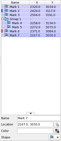
The row can be sorted by clicking a column name on the header of the datalist. If it is clicked again, the sort becomes in reverse order. Numeric values and strings are sorted separately. If the column value is a numerical value followed by a string, the numerical part is sorted first, and then if the numerical parts are the same, the following string is sorted. If there are exactly the same values, their order is maintained before and after sorting.
| Icon | Item | Action |
|---|---|---|
| Icon | Left-click the icon of an item to display its Property. | |
 |
Lock | (Visible only on mouse hover) Lock the item so that it is not deleted when you clear the datalist. |
 |
Bookmark | (Visible only on mouse hover) Bookmark the item for easy cruising. |
| Menu | Action |
|---|---|
| Create New Group | Group the specified items. |
| Ungroup | Ungroup the specified group. |
| Representative | Treat the specified item as a representative of the group. If it is outside of a group, it will not work. |
| Jump | Center the screen to the specified item. |
| Start Auto Navigation | Start the auto-navigation from the specified item. Refer to Auto Navigation Bar page. |
| Select/Deselect | Reverse the select state of the specified item. |
| Show | Reverse the display state of the specified item on the screen. |
| Display/Name | Reverse the name display state of the specified item on the screen. |
| Display/Coordinates | Reverse the coordinates display state of the specified item on the screen. |
| Color | Open a color specification dialog that changes the color of the specified item on the screen. |
| Lock | Reverse the lock state of the specified item. The locked items are not deleted when you clear the datalist. |
| Bookmark | Reverse the Bookmark state of the specified item. You can scroll only bookmarked items with dedicated buttons. |
| Shape/Dot | Change the symbol for the specified item. It will be a flag in the list and a dot on the screen. |
| Shape/Cross | Change the symbol for the specified item. It will be a cross both in the list and on the screen. |
| Shape/X | Change the symbol for the specified item. It will be the X character both in the list and on the screen. |
| Shape/Square | Change the symbol for the specified item. It will be a square both in the list and on the screen. |
| Thumbnail/None | Change the image of the specified item to none. |
| Thumbnail/In-Line | Change and update the image of the specified item to in-line size. |
| Thumbnail/Small | Change and update the image of the specified item to small size. |
| Thumbnail/Middle | Change and update the image of the specified item to middle size. |
| Thumbnail/Large | Change and update the image of the specified item to large size. |
| Set as the Origin | Move the Chip and Marks so that the origin is at the specified item. |
| Move in Tree | Move the specified item in the datalist. |
| Expand | Expand the tree view of the specified item. |
| Collapse | Collapse the tree view of the specified item. |
| Expand All | Expand the tree view of all items. |
| Collapse All | Collapse the tree view of all items. |
| Properties | Open the File Properties dialog that displays the properties of the specified item. |
| Delete | Delete the specified item. |
When marks are created or edited, an unsaved indicator (*) appears in the panel title section.
If you try to exit neoEBV while the unsaved indicator is displayed, a dialog box to warn you that there is an unsaved change will appear.
The unsaved indicator will be cleared when the changed mark is saved, cleared, or loaded.
If you do not need the confirmation for unsaved changes, you can turn it off from the preference.
See Confirm Data Save Status before Exit/Mark in Preference Window/Data List page.
Add a mark at any position.
Group the marks you have created.
User can specify a determination method of coordinates and a name of a mark by a formula expression with column names.